Designing the App Behind America's Waste Network
Waste Connections runs hundreds of districts across the US and Canada. Their app only showed a pickup calendar. We redesigned it into a unified platform for payments, scheduling, service requests, and recycling guides, while building a branding system that adapts to every district they serve.
One Platform, Every District
Branded for
Every Community
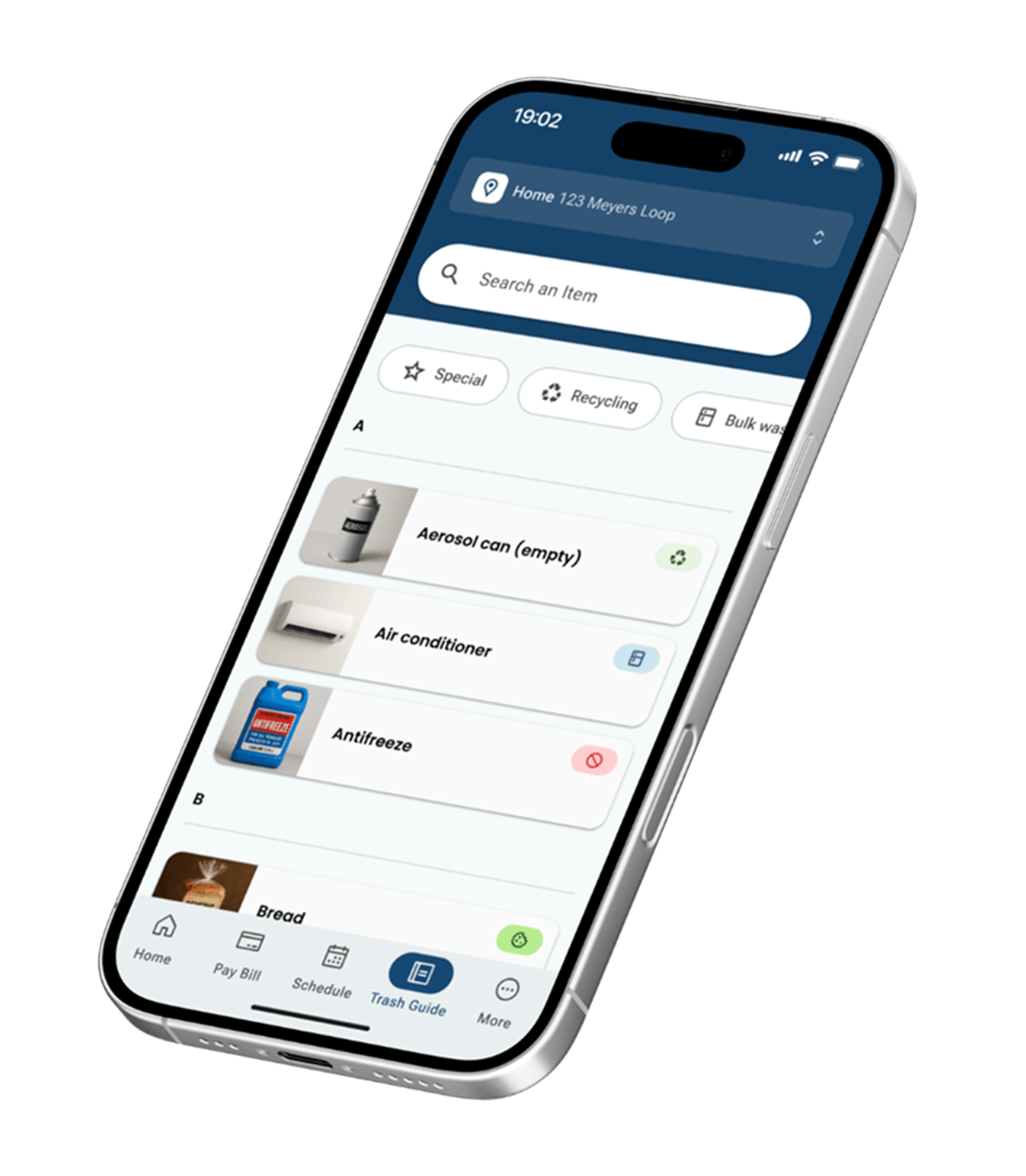
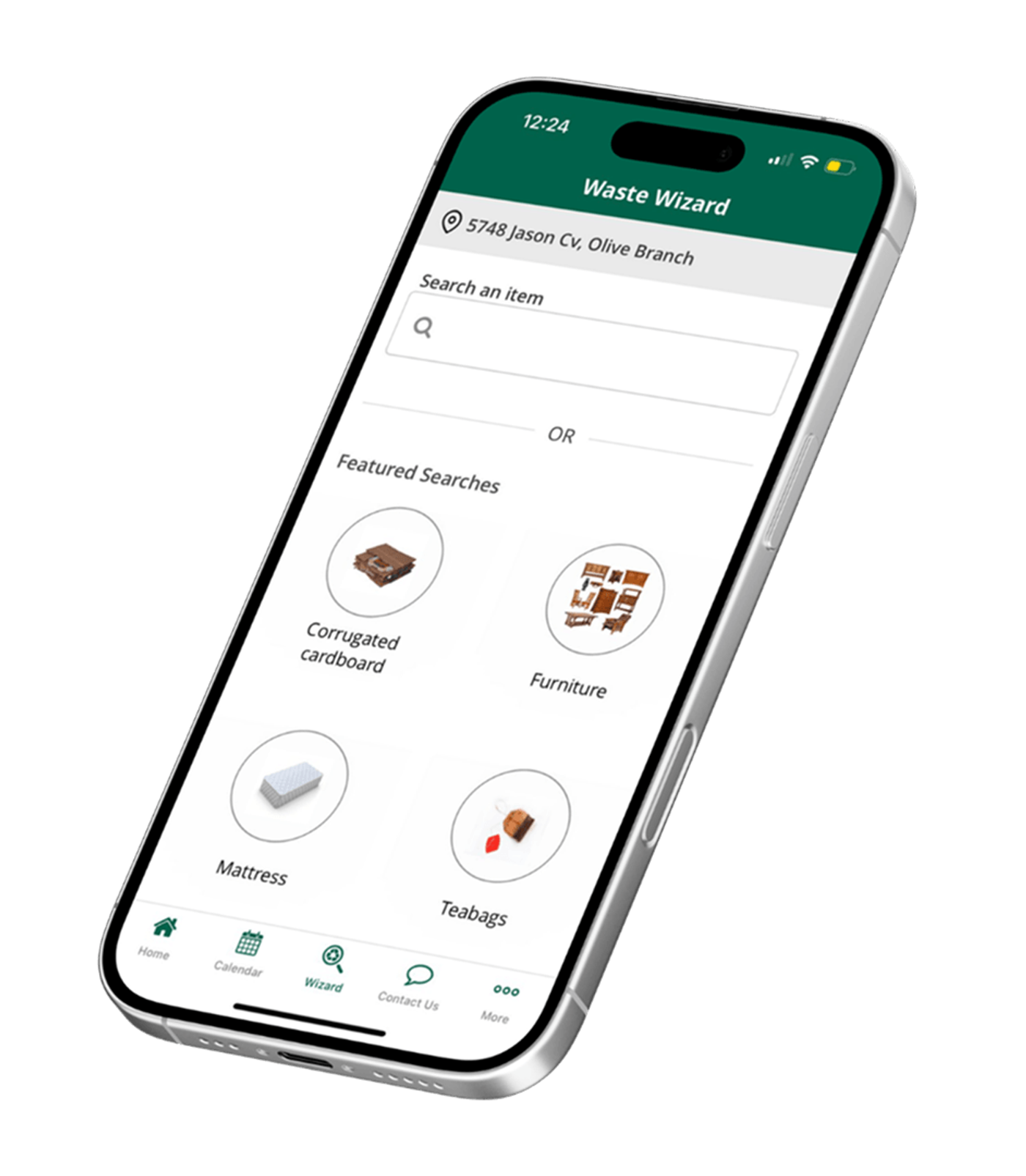
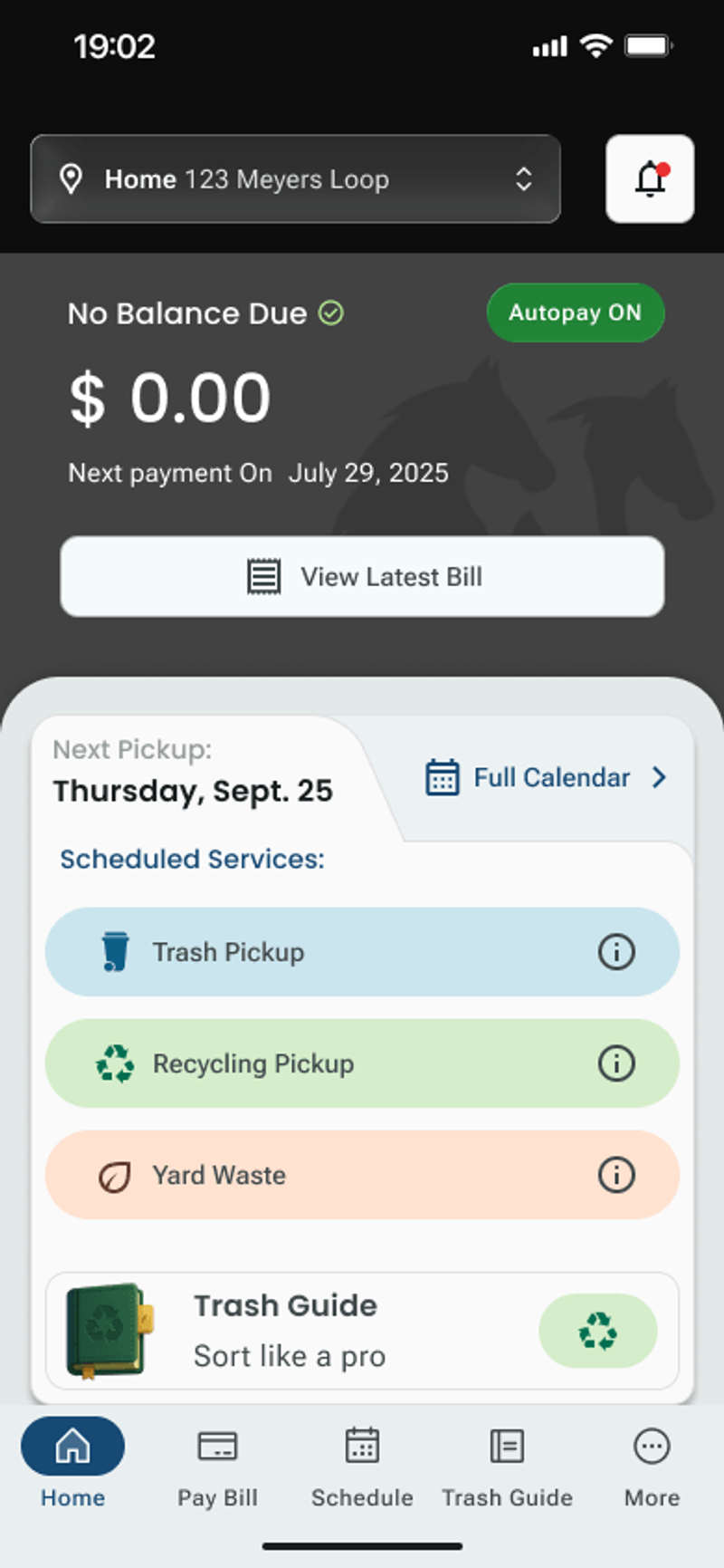
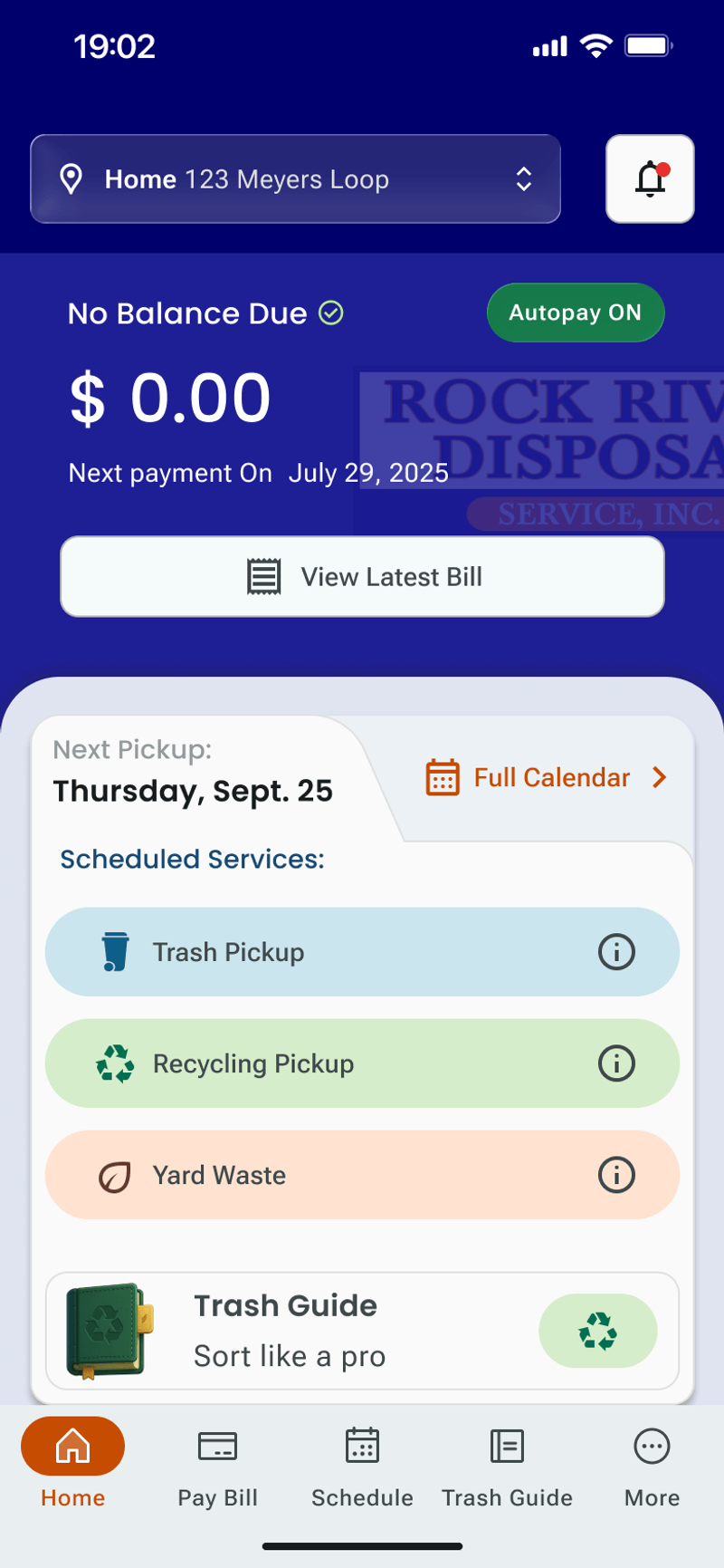
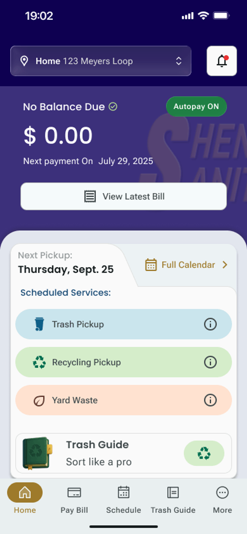
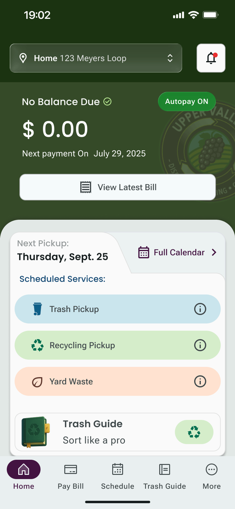
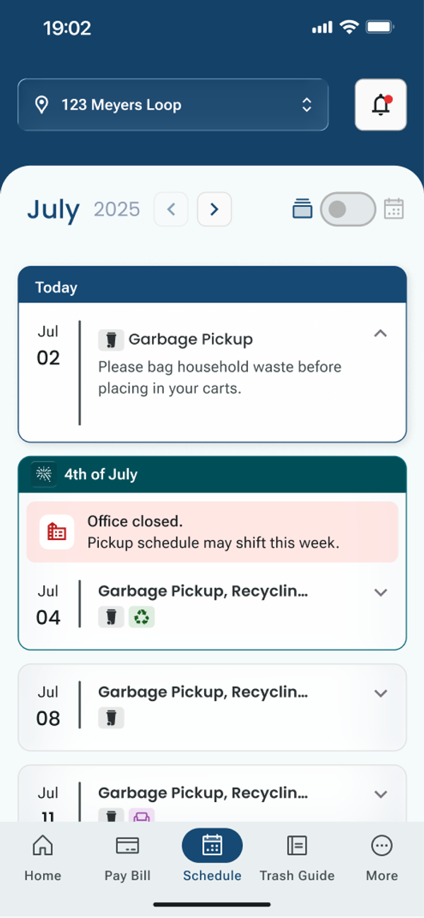
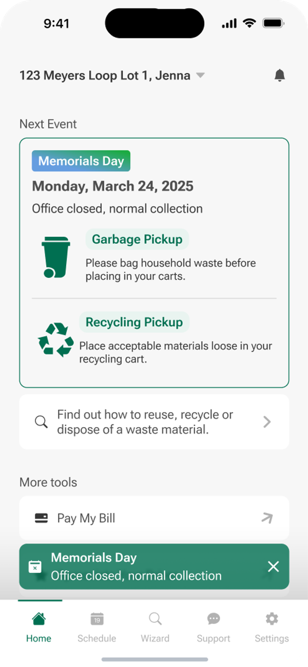
Waste Connections operates over 100 districts, each with its own identity. The app adapts seamlessly: same platform, every brand.

Before & After
A Different Kind of Utility App
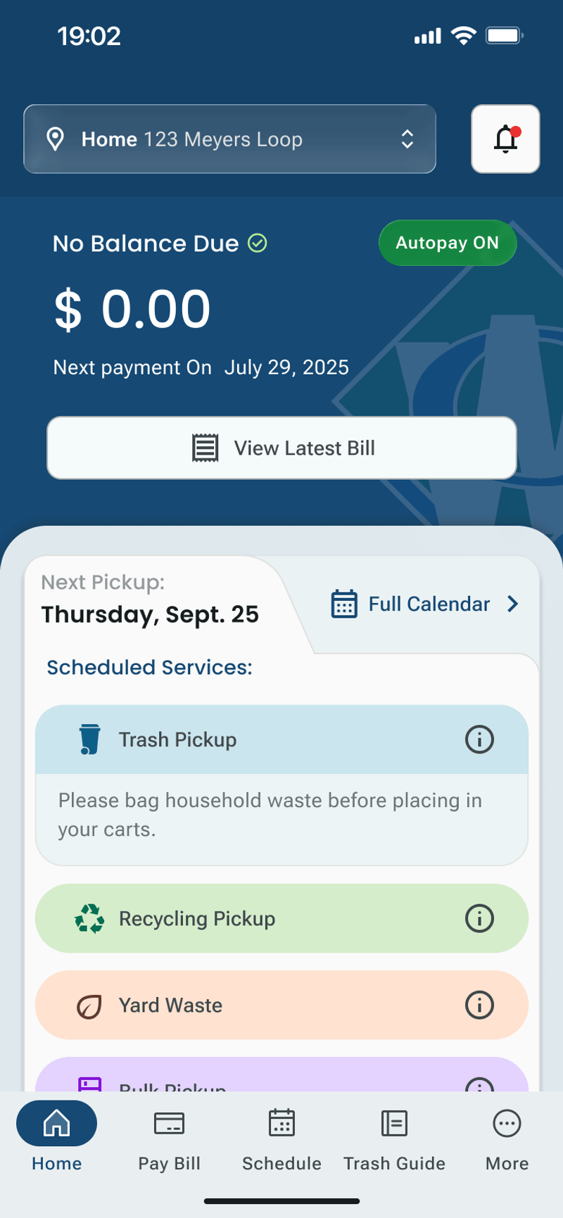
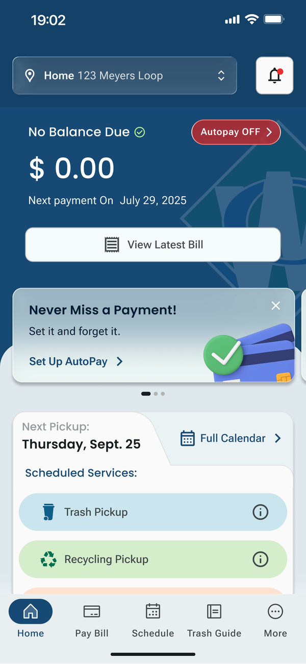
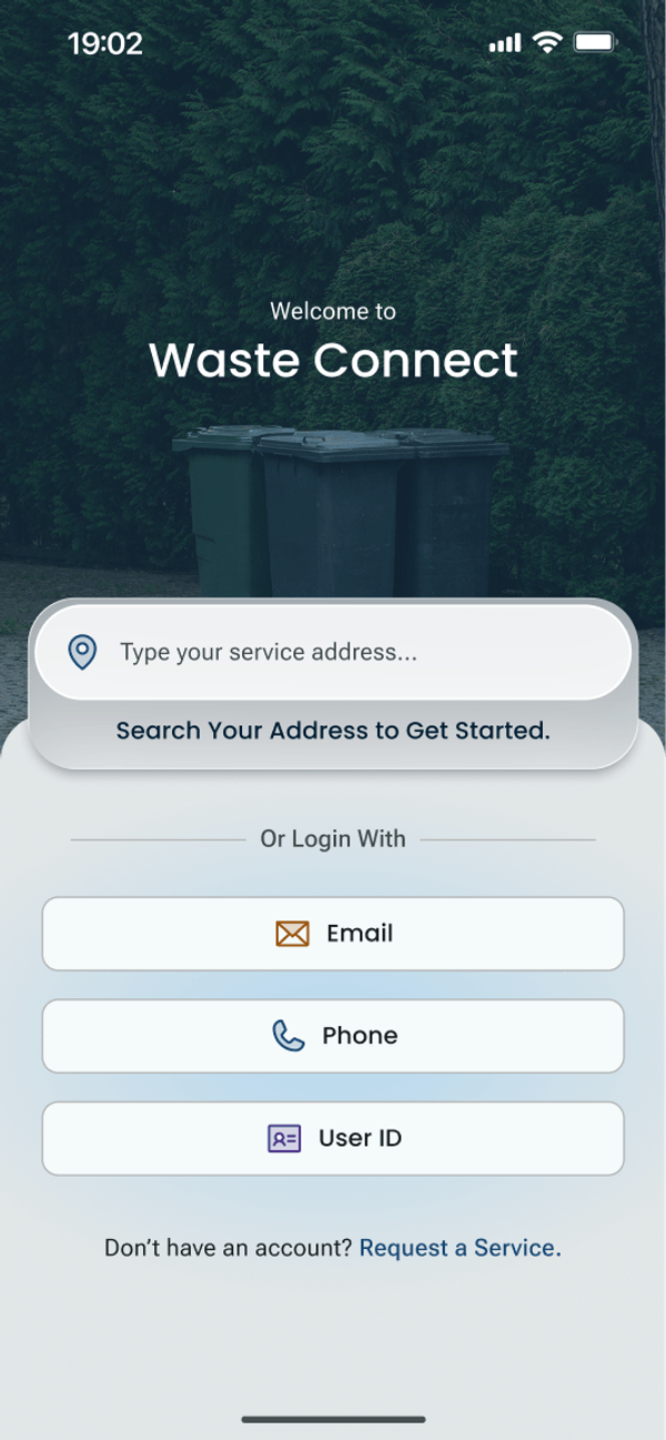
The original interface was purely functional: a zip code field and a pickup calendar. We introduced a visual language that feels modern and trustworthy, built to stay coherent with each district's existing website branding. The goal was something that looks nothing like a typical waste management app.
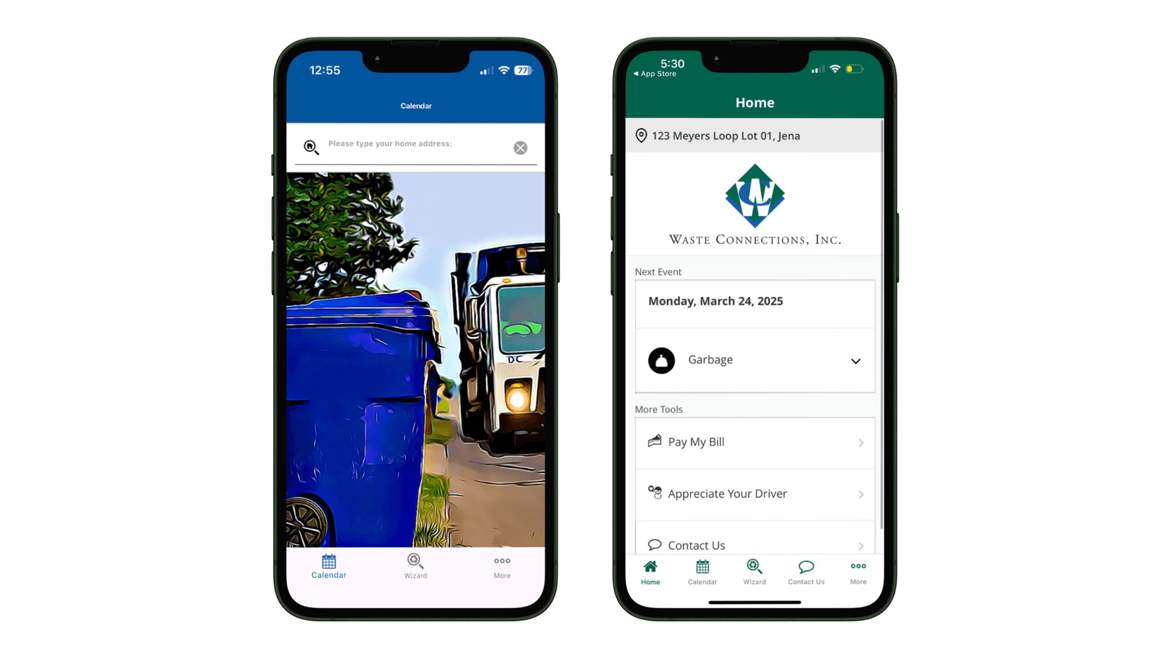
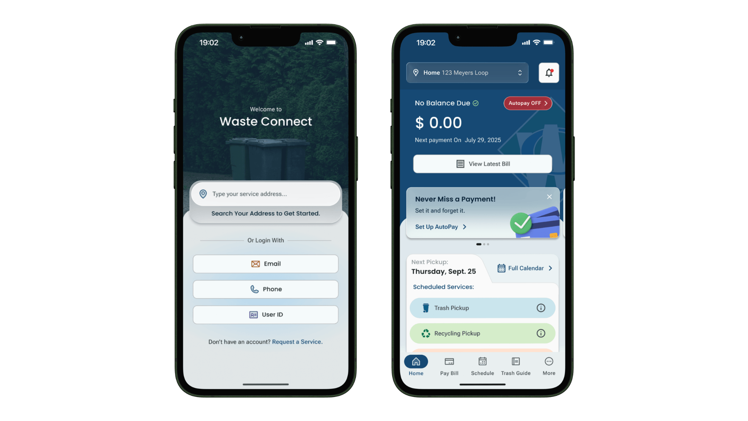
Hover or drag the slider to compare
- Coverage
- US & Canada
- Company Scale
- $9 Billion Revenue
- Model
- Decentralized, 100+ Districts
- App Design Delivered
- November 2025
The Client
A $9 Billion Company That Runs on Local Identity
Waste Connections is one of the largest waste management operators in North America, serving residential, commercial, and municipality customers across hundreds of districts in the US and Canada. Their growth strategy is built on acquisition: when they buy a smaller garbage company, they keep its original name, branding, logo, and employees. Every district maintains its own identity.
That decentralized model created a unique design challenge. The app needed to serve millions of customers while adapting to hundreds of distinct brands, without fracturing the experience or the codebase.
The Process
How We Did It
Eight phases across research, design, and strategy. Each one feeding the next.
Phase 1: Research & Alignment
Stakeholder Research
Rather than interviewing end users directly, we went wide across the organization: customer service teams, the web team, district managers, development leads, and sales staff. Each group held a different piece of the puzzle. Our job was to connect them.

Phase 1: Research & Alignment
UX Audit & Flow Mapping
The old app was a zip code lookup. No accounts, no payments, no profiles. We mapped everything that needed to change, identified the backend constraints that would shape the scope, and laid out all the edge cases: residential customers, municipality users who don't pay, commercial accounts with different schedules.
Phase 1: Research & Alignment
Style Exploration
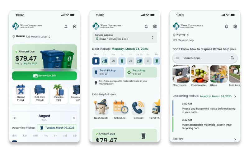
We presented three distinct visual directions for the home screen. The client had their own preferences, but we pushed for coherence with the existing web design system we had built for their website migration. In the end, a single direction was chosen and we moved straight into high fidelity.
Phase 2: Design
Design System & District Branding
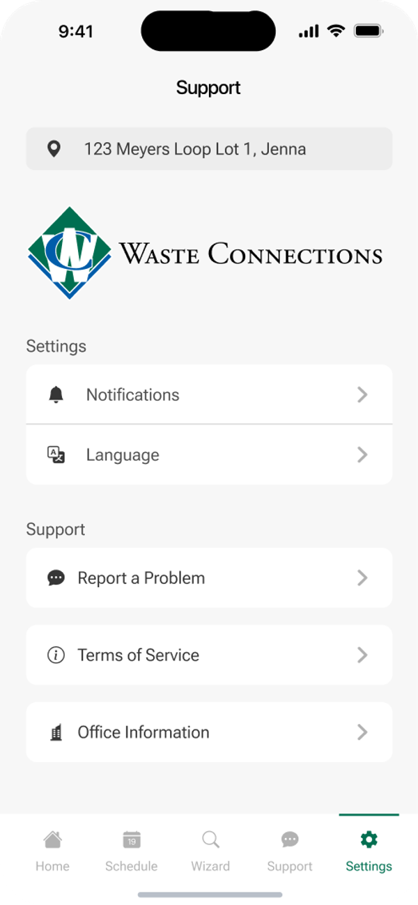
We spent two full days solving one problem: how should the app adapt to hundreds of different district brands without looking like a different app each time? The answer was surgical. We defined exactly which elements change (the logo, placed in a single designated spot, and the primary action color) and which stay fixed everywhere else.
Phase 2: Design
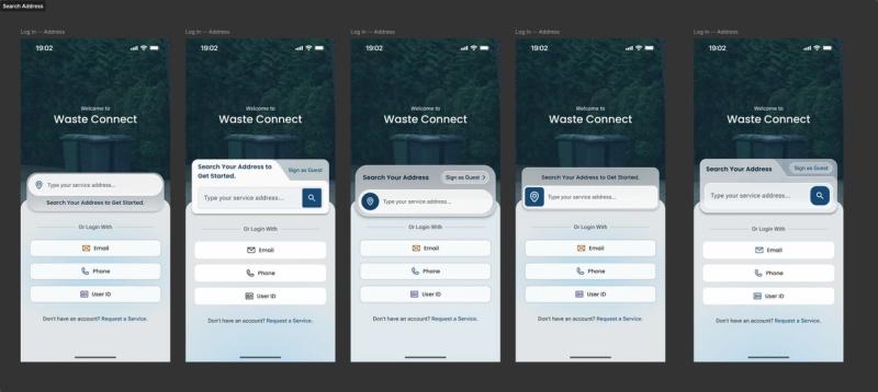
Login Flow Redesign
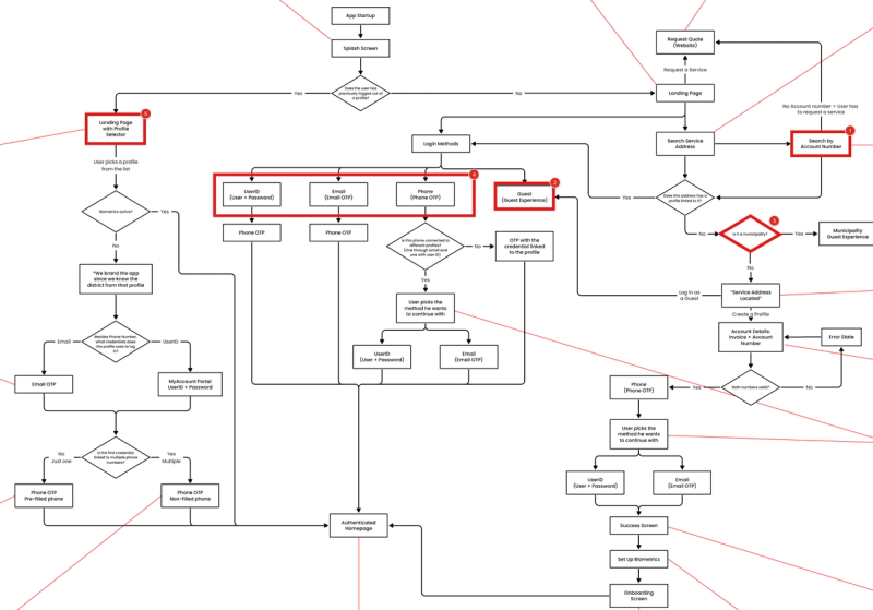
This was the hardest part. The development team's proposed login flow had logical gaps they hadn't resolved on their side. We built the complete flow ourselves in Figma, marked every broken step in red, and sent it back. The message was clear: fix your backend logic, then come back. Three weeks later, we had a resolved architecture we could actually design around.
Phase 2: Design
Full App Design
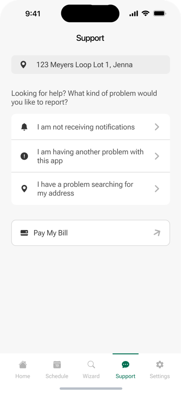
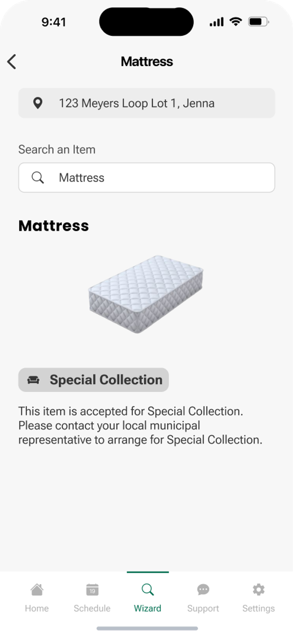
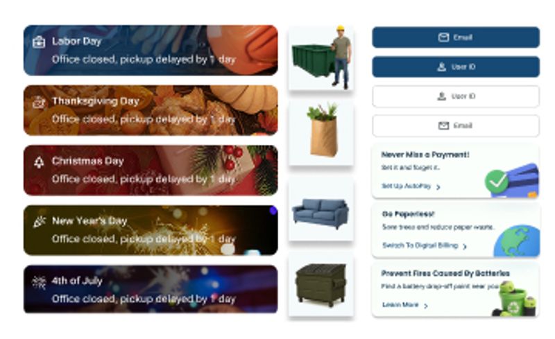
High-fidelity screens across every section of the app: home dashboard, pickup calendar, payment status, service requests, holiday schedules, the Waste Wizard recycling guide, promotions, and account management. We delivered in stages, sending each section first to the development team for feasibility review, then to a select group of districts for feedback.
Phase 3: Extensions
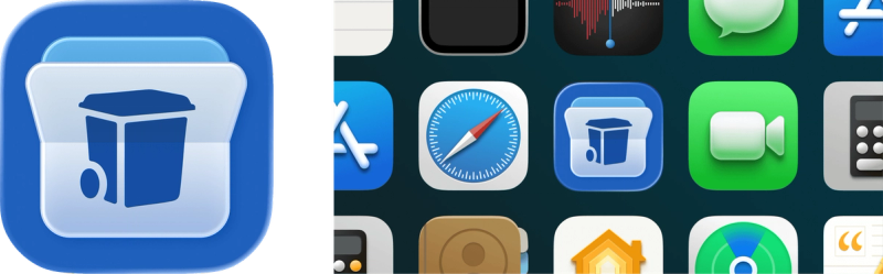
Logo Redesign
The app needed a fresh identity to match the new experience. We proposed four logo concepts for the Waste Connect app icon, and the client selected one. A small deliverable with a clear purpose: the new app deserved a mark that looked nothing like the old one.
The Brief
Client Needs & Objectives
The existing app was a read-only calendar connected to a third-party database. Customers could search by zip code and see a pickup schedule. Nothing more. Waste Connections wanted to own their data, unify the experience, and build a platform they could scale across every district they serve.
End reliance on a third-party vendor. Own the data, own the platform.
Schedules, payments, and service requests: one app, not four websites.
Push notifications for delays and holiday changes instead of emails nobody reads.
One codebase, 100+ brand identities. Logo and color swap per district automatically.